
The average email gets nine seconds of attention before a reader decides to engage or delete. For DTC brands competing in crowded inboxes against hundreds of promotional emails per week, those nine seconds are everything. And yet, most DTC founders spend hours agonizing over subject lines and copy while treating email design as an afterthought — a drag-and-drop template filled in five minutes before hitting send.
That approach leaves revenue on the table. Research consistently shows that email design — visual hierarchy, layout, and mobile optimization — has a larger impact on click-through rates and conversions than copy alone. Brands with best-in-class email design see open rates between 30 and 40 percent, compared to the industry average of 21.5 percent. The difference is not better subject lines. It is better first impressions.
Why Design Matters More Than Copy for DTC Email
Copy tells people what to do. Design tells people where to look. In a medium where readers are scanning, not reading, the visual structure of your email determines whether your message lands at all.
Consider what happens when someone opens a promotional email on their phone — which is how more than 55 percent of all email opens occur. They see a screen roughly 375 pixels wide. If your email has three columns, six links, two competing buttons, and a wall of text, nothing stands out. The reader taps delete before processing a single word of your carefully written copy.
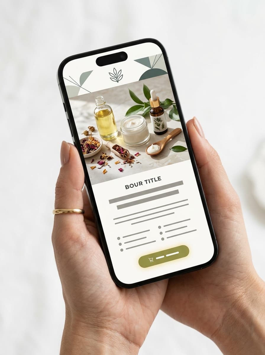
Now imagine the same email with a single large product image, one bold headline, and one button. The eye knows exactly where to go. The reader does not need to decide what matters — the design decides for them. That is the fundamental principle behind DTC email campaign design that converts: reduce decisions, increase clarity.
5 Design Principles That Drive DTC Email Conversions
1. Mobile-First Layout
With 55 percent of email opens happening on mobile devices, designing for desktop first and hoping it scales down is a recipe for broken layouts and lost revenue. Mobile-first DTC email design means starting with a single-column layout, using large tap targets (minimum 44 x 44 pixels for buttons), and ensuring your hero image and primary CTA are visible without scrolling.
The best-performing DTC emails load their most important content — the hero image, headline, and CTA — within the first 350 pixels of vertical space. Everything below that is supporting content for readers who are already interested.
2. Single, Unmistakable CTA
Every additional call-to-action in an email dilutes the impact of the primary one. Top-converting DTC campaigns use a single, visually dominant button with action-oriented text. Not "Learn More" — but "Shop the Collection," "Get 20% Off," or "Build Your Bundle."
The button should use a contrasting color from your brand palette, have generous padding (at least 16 pixels on all sides), and sit in a clear area of whitespace so the eye is drawn to it naturally. Segmented campaigns that follow this principle see up to 101 percent more clicks than those with multiple competing CTAs.
3. Visual Hierarchy That Guides the Eye
Effective email design creates a deliberate reading path: hero image first, then headline, then supporting text, then CTA. Each element should be visually distinct in size, weight, and spacing so the reader instinctively follows the intended flow.
Use font size contrast to establish hierarchy. Your headline should be at least 1.5 times the size of your body text. Subheadings should fall between the two. Avoid using more than two typefaces in a single email — one for headings, one for body.
4. Brand Consistency Across Every Send
DTC brands live and die by recognition. Your email campaigns should feel like a natural extension of your website, social media, and packaging. That means consistent use of brand colors, typography, logo placement, and photography style across every email you send.
This is not just aesthetic preference — it is a deliverability signal. Subscribers who instantly recognize your brand are less likely to mark emails as spam, which protects your sender reputation over time.
5. Dark Mode Compatibility
Eighty-two percent of smartphone users have dark mode enabled, and 34 percent of email recipients view emails in dark mode. If your email design only accounts for light backgrounds, one in three readers is seeing a broken or unreadable version of your campaign.
Dark mode-safe DTC email design means avoiding transparent PNGs with dark elements (they disappear against dark backgrounds), using sufficient contrast ratios for text, and testing your emails in both modes before every send. Adding a thin border or subtle background to images prevents them from blending into dark mode backgrounds.
Before and After: What Good DTC Email Design Looks Like
The difference between a high-converting DTC email and a mediocre one often comes down to restraint. Removing clutter does more for conversion rates than adding more content ever will.
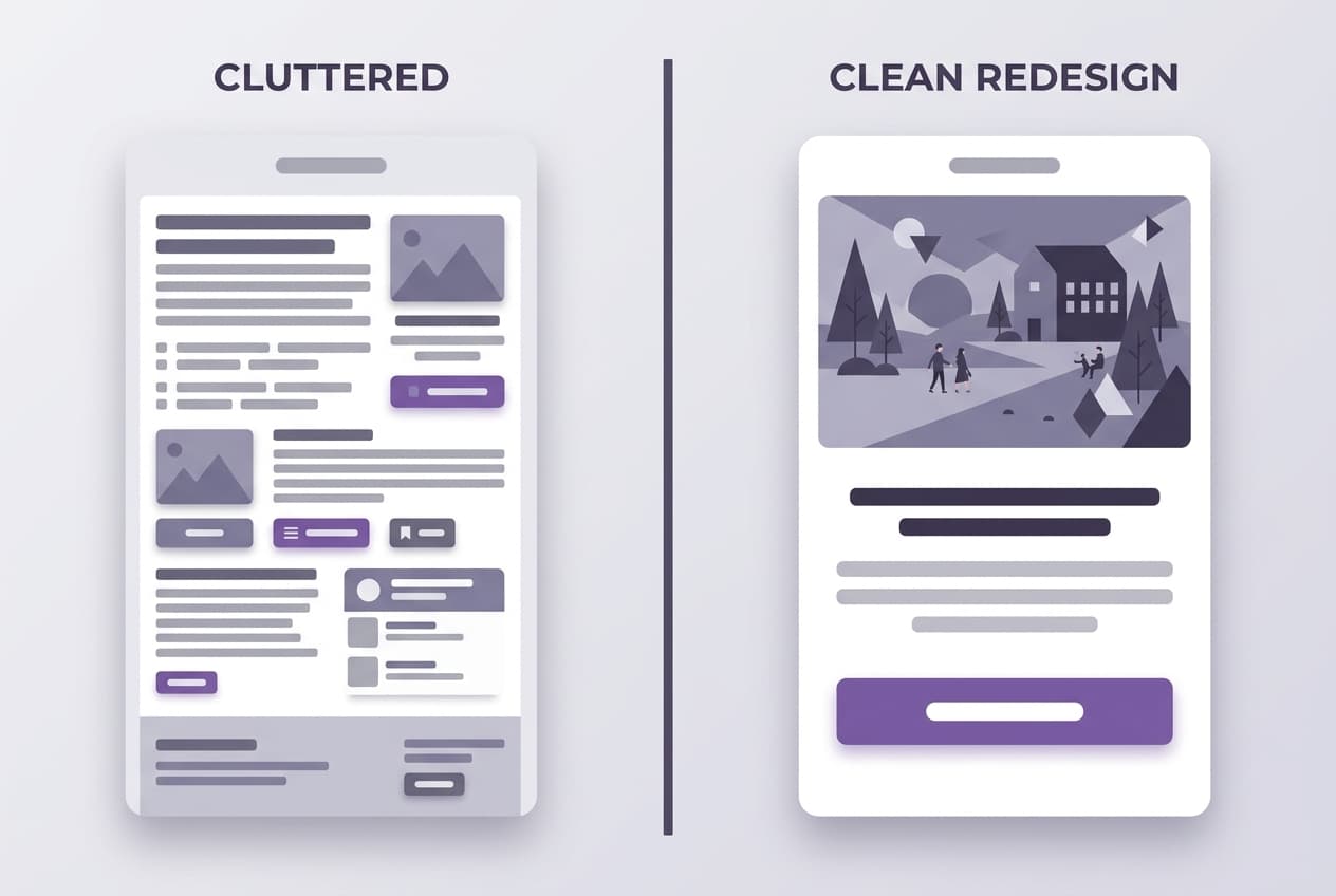
The cluttered version tries to say everything at once — multiple product grids, social links, navigation bars, and three different call-to-action buttons. The redesigned version leads with one hero image, one headline, and one button. It communicates more by showing less.
The Mobile-First Imperative
Testing your email on desktop alone is no longer sufficient. The majority of your DTC audience is reading email on a phone screen, often while commuting, waiting in line, or scrolling in bed. Your design needs to account for thumb-friendly tap targets, fast-loading images, and layouts that do not require pinching or zooming.
Key mobile design considerations for DTC email campaigns:
- Single-column layout — no side-by-side elements that break on small screens
- Hero image width at 100% — fills the viewport for maximum visual impact
- Font size minimum 16px — anything smaller forces pinch-to-zoom on mobile
- Button width at least 80% of container — easy to tap with a thumb
- Preheader text optimization — the preview text visible in the inbox before opening
How AI Is Changing DTC Email Design
The biggest barrier to great DTC email design is not knowledge — it is time. Most DTC founders know what good design looks like. They follow enough brands and receive enough emails to have strong instincts. The problem is that building a well-designed campaign from scratch takes four to six hours when you factor in image selection, layout, copywriting, and mobile testing.
AI-powered email design tools are closing that gap. Instead of starting from a blank template, platforms like SendKite analyze your brand's visual identity, product catalog, and social content to generate fully-designed campaigns that match your aesthetic — in minutes rather than hours.
The AI handles the design decisions that eat up the most time: selecting the right template layout for your content, matching brand colors and typography, choosing and editing hero images, and ensuring the entire campaign renders correctly across desktop, mobile, and dark mode. The result is a campaign that looks like it was designed by a dedicated email designer, even when you are a team of one.
Getting Started: Quick Wins You Can Implement Today
You do not need to overhaul your entire email program overnight. Start with these three changes that have the largest impact on DTC email conversion rates:
- Audit your CTA count. Open your last five campaigns. If any of them have more than one primary button above the fold, consolidate. One clear CTA per email.
- Test on mobile first. Before you hit send on your next campaign, open the preview on your phone. If the hero image is cropped, the text is too small, or the button is hard to tap, fix it before anything else.
- Check dark mode. Send yourself a test email and view it with dark mode enabled. If images disappear, text becomes unreadable, or colors look wrong, you are losing one in three readers.
Further Reading
- Ecommerce Email Marketing Strategy: A Complete Guide
- The Best Email Flows Every DTC Brand Needs in 2026
- How SendKite Works: From Instagram to Inbox
Ready to see what AI-designed email campaigns look like for your brand? Start your free trial or see a live demo.